As promised in our latest update in June, we have prepared the new public status pages.
Last update: 14th May 2021 (added Custom domains).
12th April 2021 (added Google Analytics and homepage URL).
11th December 2020 (added compact mode and floating bar).
Content:
- Improved management
- Next level customization
- Set up a Custom domain
- Subscribe for the updates feature
- Track your visitors using Google Analytics
- Change the linkable logo/name URL
- How can I add and remove password protection?
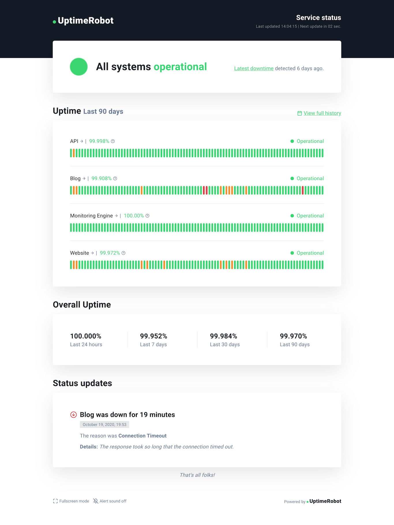
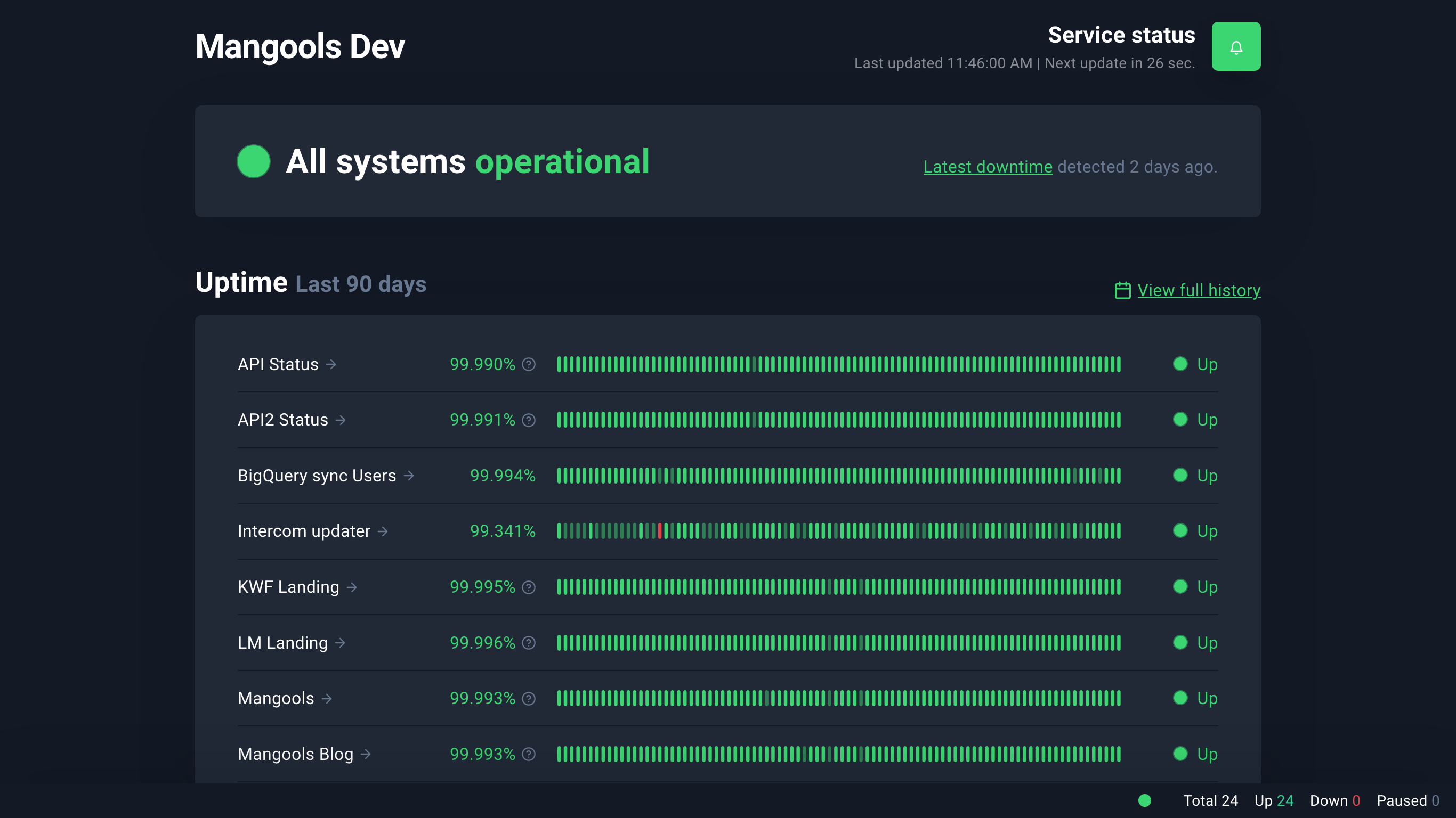
Fresh new design
After we introduced our new brand identity (while keeping the original UptimeRobot spirit) the next step was to update the look of our status pages to match this new design language.
So, go ahead and take a look at our live demo or the screenshot below.
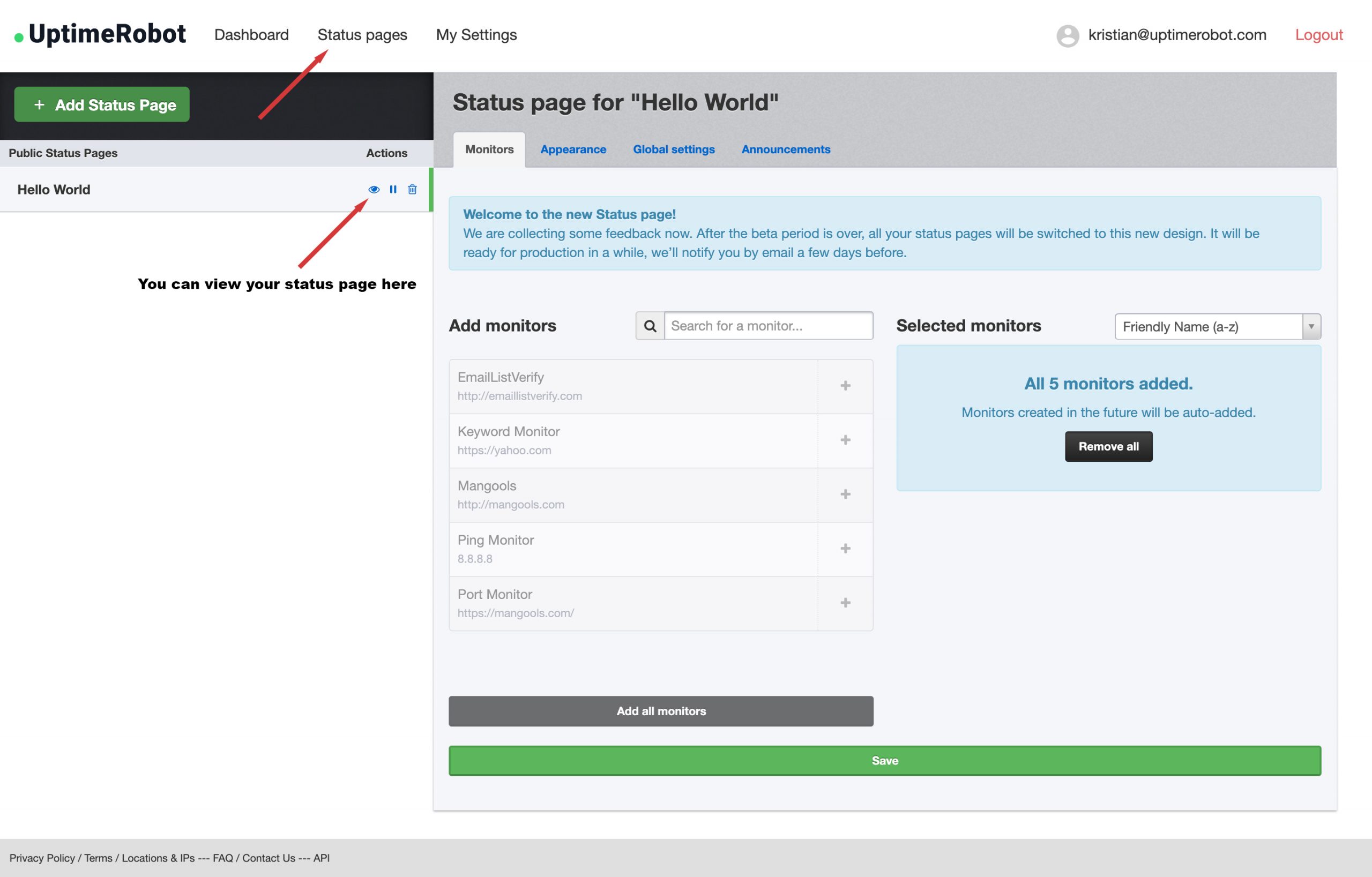
Improved management
You will find a new “Status Pages” section after you log in. We moved the original embedded settings into a separate page to make the status page management much more convenient.
Click on the “eye” icon next to the status page name to see your existing status page in the new look. Adding and removing your monitors is also very simple and intuitive.
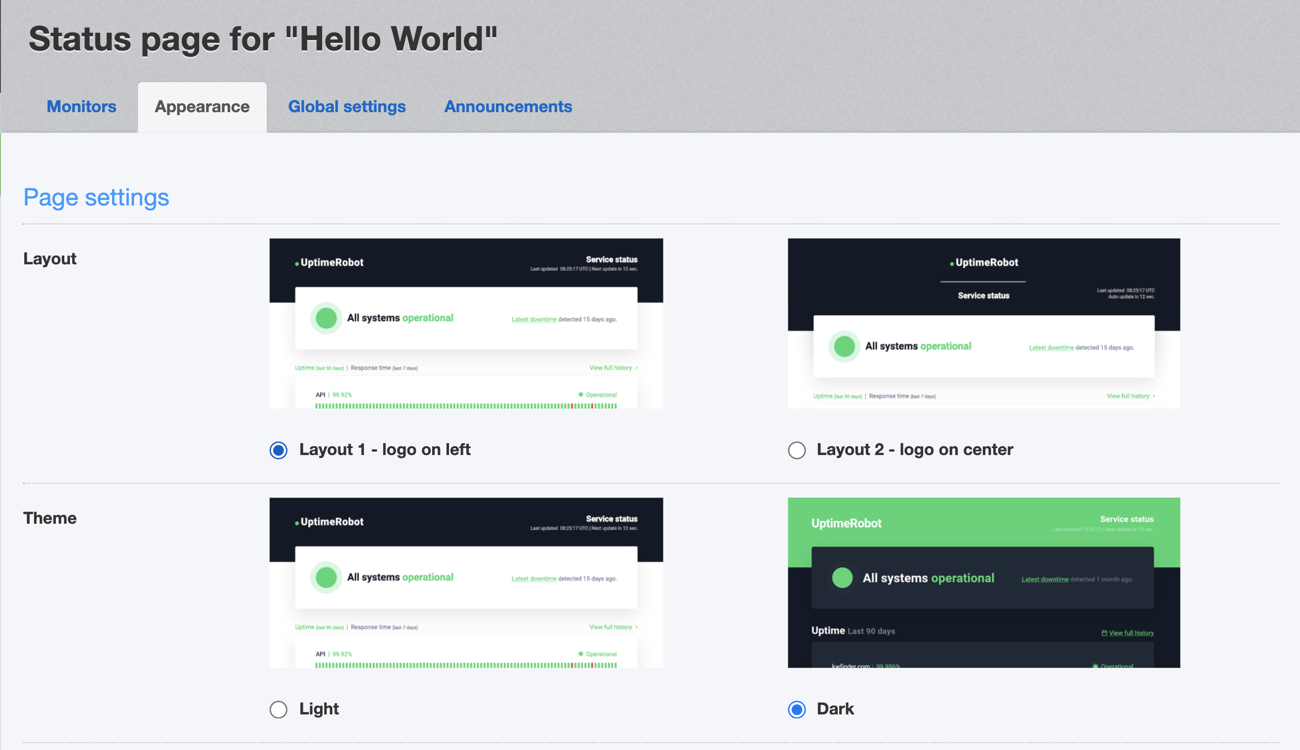
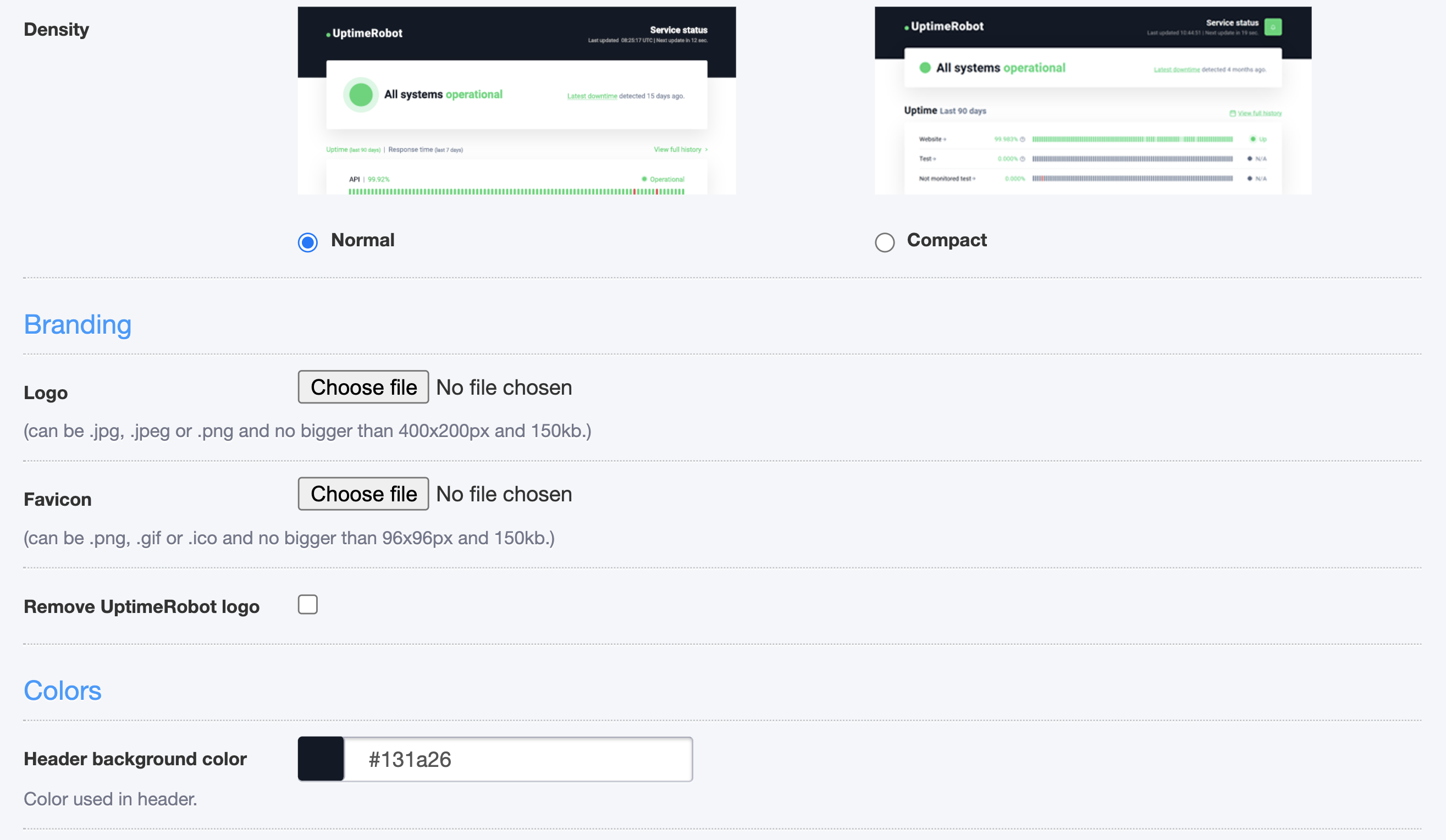
Next level customization
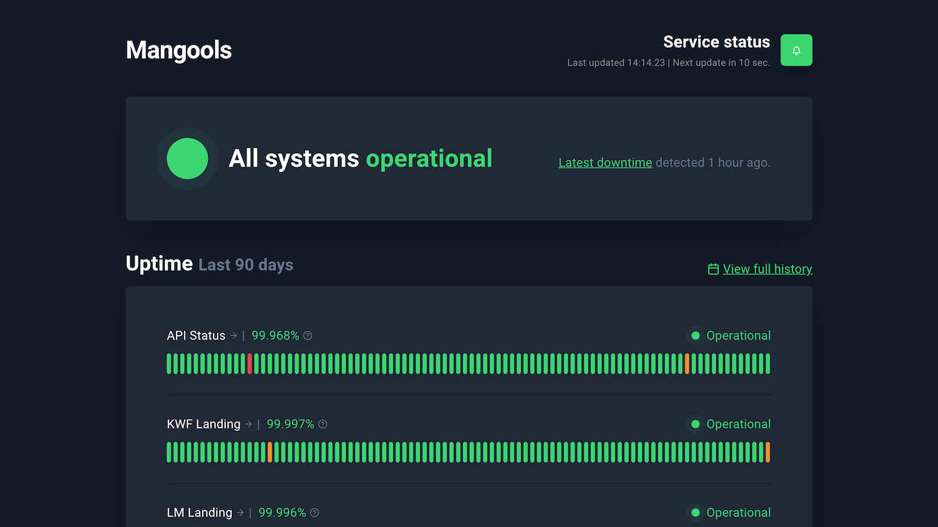
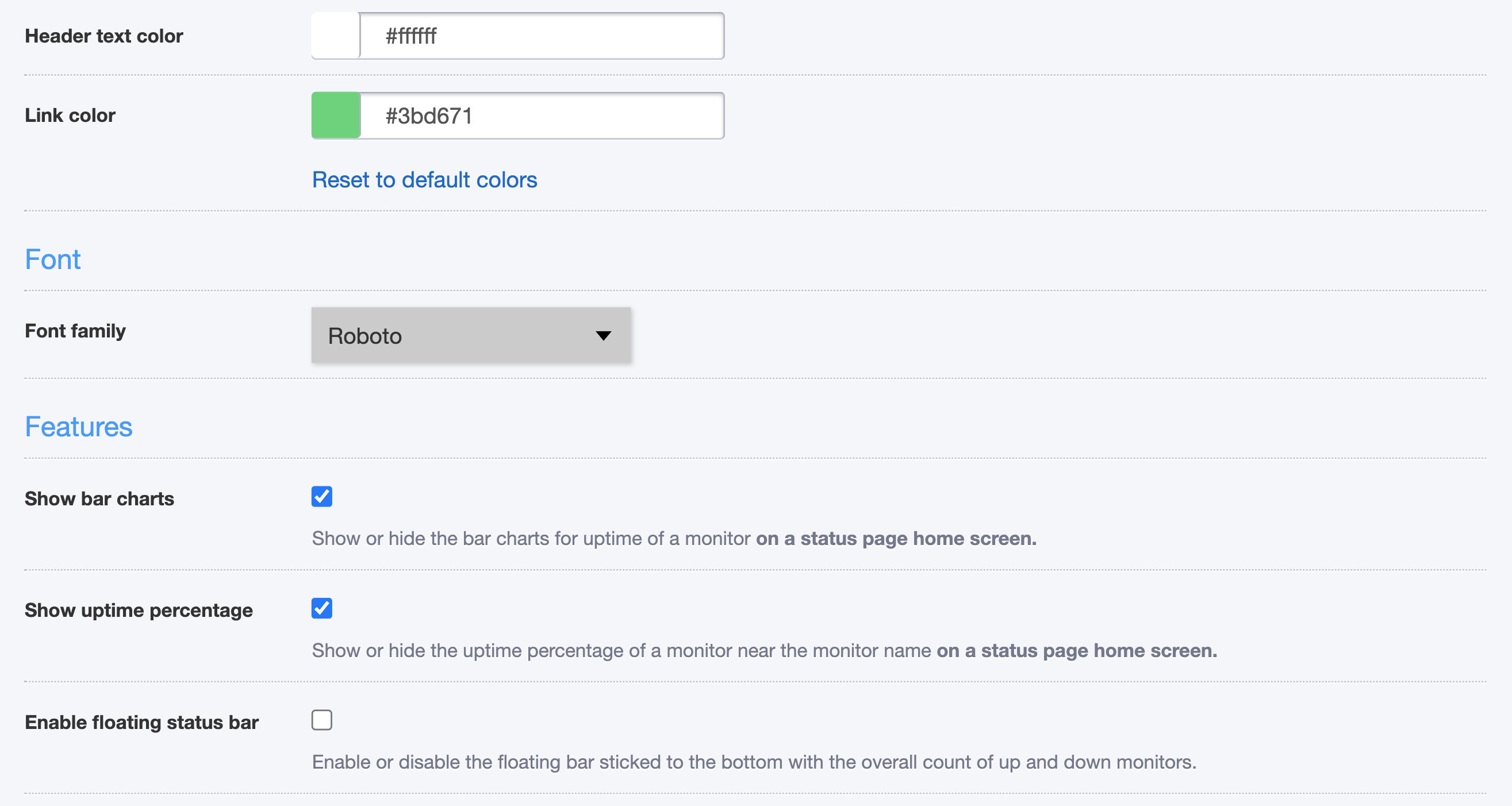
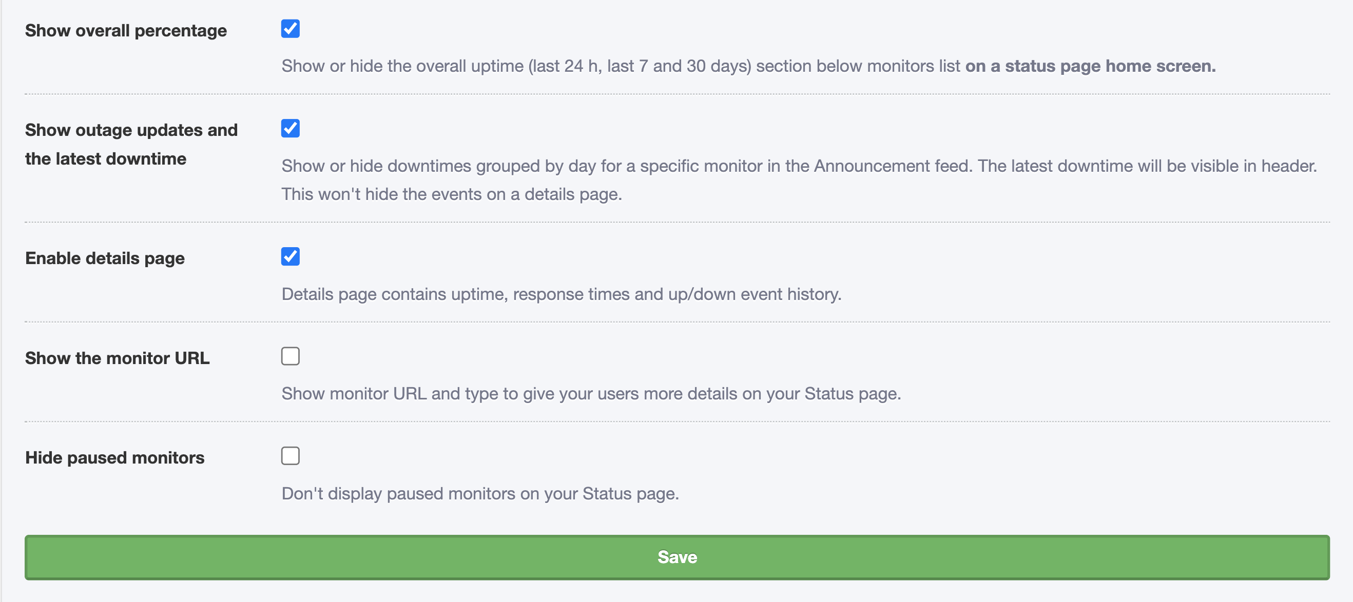
Don’t like the colors? Choose your own or even change a font family. Besides the custom logo, you can now also add your own favicon. There are two main layouts and two color schemes available. Yes, we did not forget the dark theme! There’s a compact layout available too, for those who need more density.
Here are the individual features you can turn on or off. You will find them under the Status Pages > Appearance settings:
(Updated: 11th December 2020) As many of you asked for more density in the data shown, we have added the compact layout. You can also enable a floating bar showing the total number of your up/down/paused monitors:
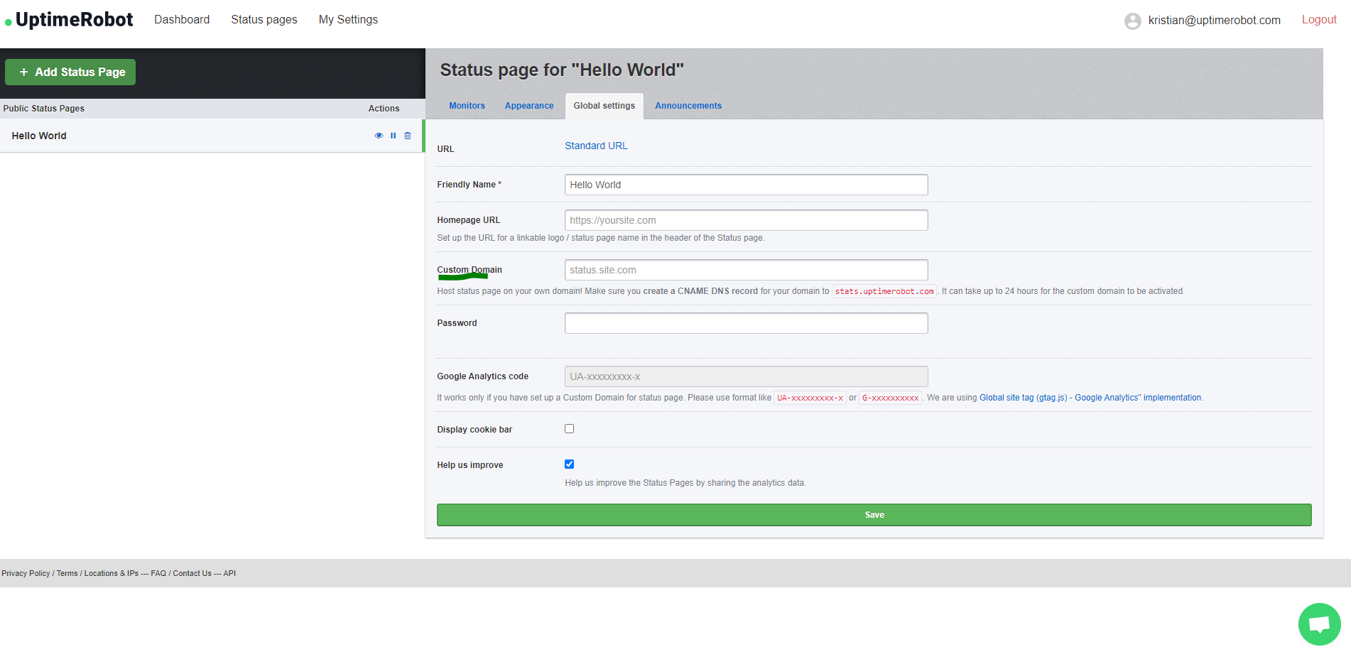
Set up a Custom domain
One of the most beloved PRO plan features of our Status page is certainly the Custom domain you can use as we do on status.uptimerobot.com.
First, make sure the CNAME DNS record of your status.yourdomain.com is set and resolving correctly to stats.uptimerobot.com. This might take some time, so please, be patient.
You can set the Custom domain for your Status page when you log in to your account at UptimeRobot.com under “Status page” > “Global settings” > “Custom domain“.
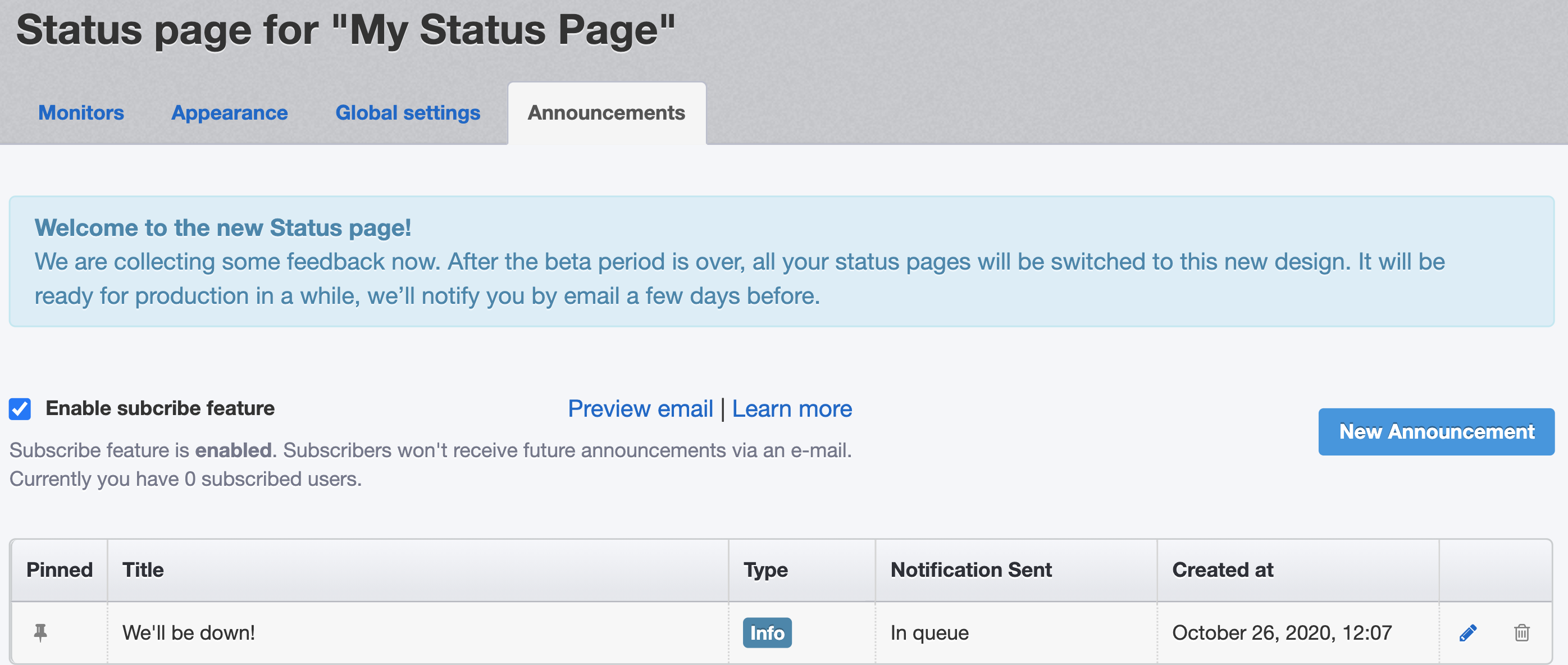
Subscribe for the updates feature
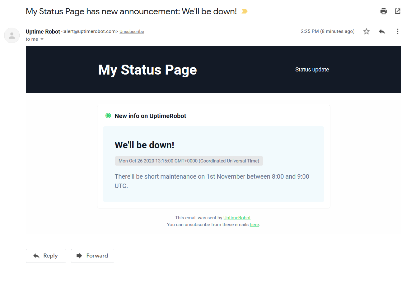
Allow anyone to subscribe and we will email them when you add an announcement or update to your status page. It will be sent within a short time window after the announcement is added (so you’ll have a chance to fix a potential typo).
You can enable this new feature under Status Pages > Announcements. You can also preview the email there.
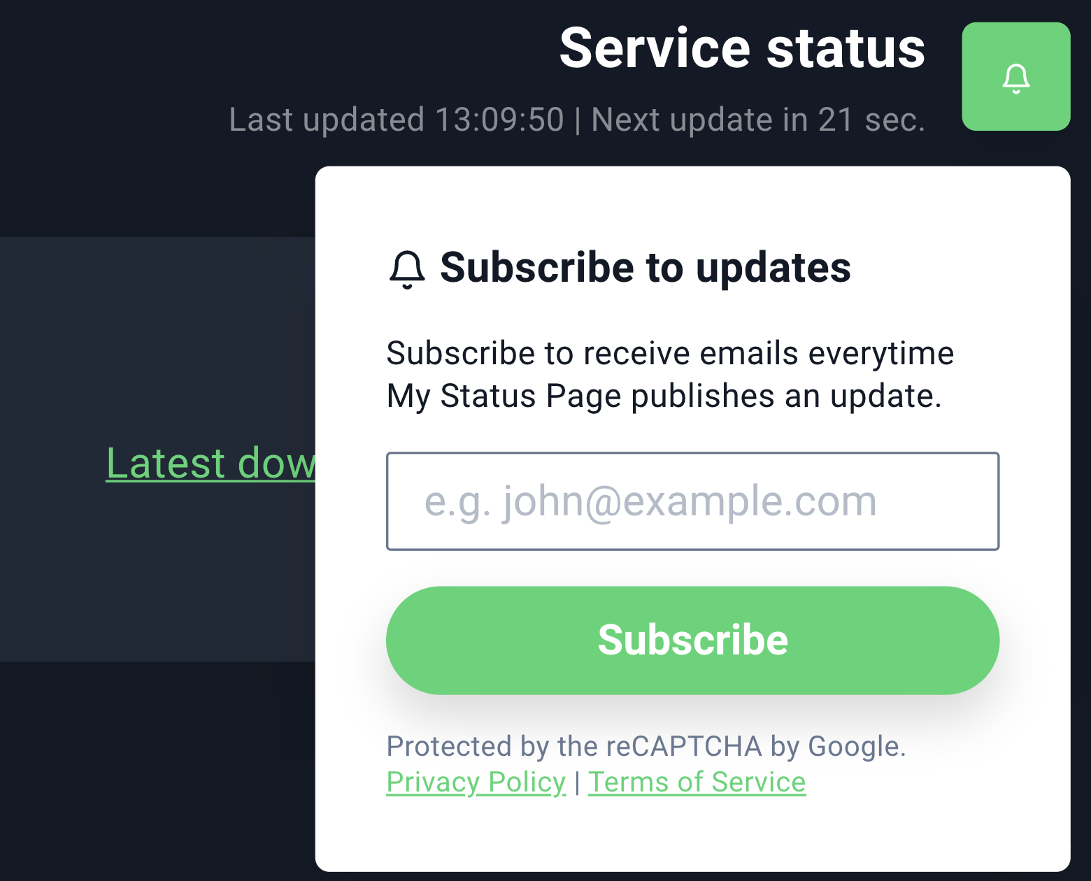
After you enable it, a subscribe button will appear in the top right corner of your status page:
Track your visitors using Google Analytics
You can simply add your Google Analytics code under “Status page” > “Global settings”.
This is a PRO plan feature and you need to be using a custom domain.
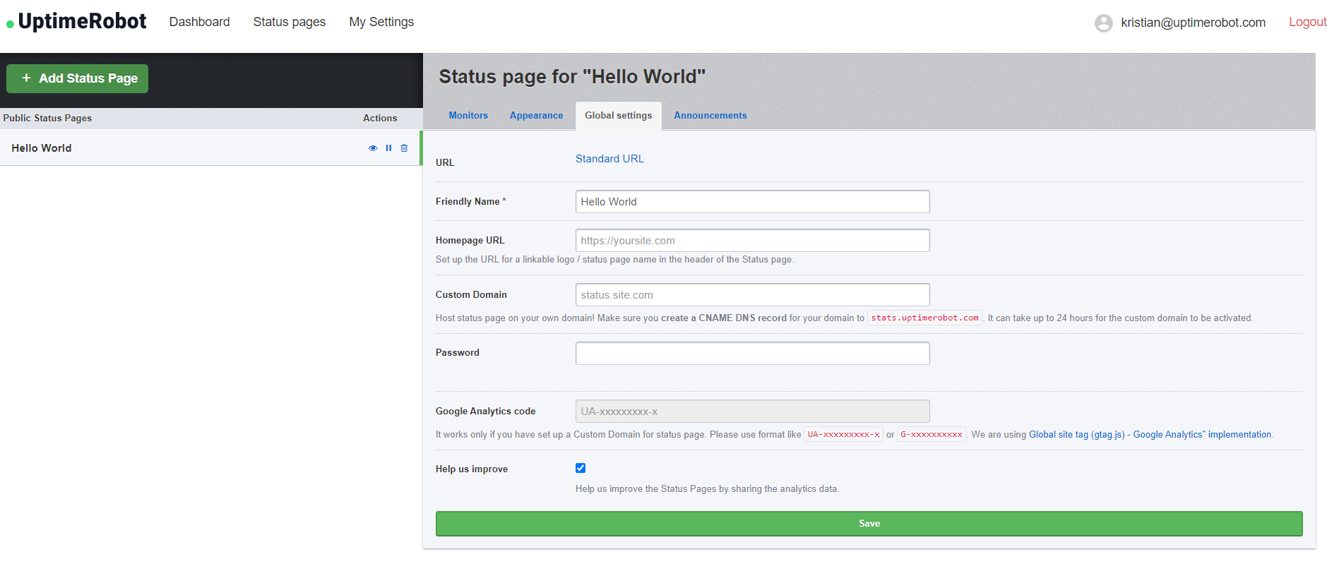
Change the linkable logo/name URL
As you might notice on the previous screenshot, you can also set up the URL of your logo or status page name in the header of your status page.
Add your URL under “Status page” > “Global settings” and click on the Save button.
How can I add and remove password protection?
Protect your status page with a password if you prefer it private.
Simply enter the password under “Status page” > “Global settings”.
If you wish to remove the password, click on “Change password” – the field will be empty. Click on the save button and the password protection will be removed.
So, what do you think?
We’re pretty happy with the updates we managed to finish despite the harsh year we’re all having. We hope you’ll love them too. Also, our totally reworked mobile app will be ready soon.
Is there something missing in our new status pages? Don’t forget to share your opinions and suggestions in the comments section or reach out to us on Facebook, Twitter, or even via email at support@uptimerobot.com. Thank you all!
101 replies on “Introducing Public Status Pages 2.0!”
Please add IPv6 support for the status pages.
It seems that you are using AWS, so it shouldn’t be a much problem.
Good to see some movement in development. New dashboard looks good, although the old dashboard wasn’t that bad. The monitors admin section is great. Good way to manage the alert contacts and maintenance windows.
Would be great to see a roadmap (with vote option 😉 )
The new support for adding notifications is a nice addition.
Thank you! We’re proud of it 🙂
Really cool, may I ask when will you apply this UI to custom domain? Looking forward to it.
Thank you for your feedback! It will be available after the full release, unfortunately, we don’t have a specific date for it yet, but it’ll be soon.
Looks real nice, looking forward to using this in production. May I suggest adding categorization for monitors? That my keep things neat for larger pages.
Hi Travis, thank you for your suggestion! Sure, this feature is already written down 🙂 We’ll see.
Let us know if you have any other ideas!
Add default sites such as Office365, Google Apps, Teams, Slack etc to the filters that you can monitor on your own custom status page.
Thank you for your suggestions, Peter!
I’m impatient to have it live in production!
It will be very soon! 😉
Hi !
The system write “Some systems down” but all monitors est up !
Normal ?
Hi,
please send us your username and the status page URL, we’ll be happy to take a look at it, thank you.
From the update to release, I no longer have the problem: https://status.vliferoleplay.fr/
StatusPage id : BQ0MWUVElR
Can we have RSS feature added to the status page also?
Hi Peter, thank you for your suggestion, we’ll discuss it with our team.
it would be important to have the option of customizing the page for other languages
Hi Marcelo, maybe one day 🙂 Thank you for your suggestion!
+1
+1
It would be ideal if they can place different languages such as Spanish.
Or have a translator to do it automatically.
The most important thing is Spanish for all Spanish-speaking companies.
Hi there, thank you for your suggestion, we’ll discuss it 🙂
yes, please!
+1
+1
It’s totally cool now. Thanks for great work.
I have just one thing – I don’t know if it’s just my blindness or there is missing sorting of monitors in status page (I think, it’s now sorted by ID or date of creation of monitors). It would be great to sort them by preference.
Hi there, thank you for your feedback! The sorting feature is on the “Monitors” tab when editing your status page, next to the “Selected Monitors” on the right side. Contact our support if you can’t find it and we’ll be happy to help.
I love the new look BUT, the design is taxing on space.
Not everyone is blind, and as soon as you add more than a few monitors you need to SCROLL for days to find what you are looking for.
Less is more, KISS.
The above is constructive criticism – use the landscape on the page carefully.
Thank you for your feedback, Jade! We can recommend disabling the “show bar charts” option under the “Appearance” tab for now to get some extra space.
I agree! Also:
* As on the private dashoard, we should be offered sorting options both in the page configuration and when viewing the page: Status (Down before Up), Alphabetical, Uptime Percentage (ascending), etc.
* I preferred seeing the exact uptime % in each cell. Yes, I’d rather see more detail about just one week than less detail about three months. I’ve used the old embedded percentages in emails to quickly see and illustrate the linkages between systems that suffered trouble due to the same root cause — I can’t do that any more. 🙁
* The new chart is more awkward to read, with the current status all the way over at the right side.The old design seemed more natural, with the leftmost cell representing the current day. If a monitor was down, you’d see that right away, not after scanning over 80+ green cells.
* The current day percentages above each monitor bar chart are similarly awkward to read. The width of the percentage value is roughly the same for each monitor, but the name of each monitor varies greatly. So if you’re trying to compare %s, it’s awkward to scan down the page. I think the current day percentages should be rendered in span or div elements that are all the same width, and to the left of the monitor names.
* The use of colors is problematic for those of us that have color perception problems (and doesn’t meet W3C WAI specs FWIW). Most similar chart, e.g. AWS Route53 Health Checks, use a combination of color and shape/height to convey health info, e.g. healthy is full height green, down is one-third height red.
* I like the Full History calendar grids but wish we could configure our status pages to use Sunday as the first day of each week.
If I could switch back to the old status pages I would. I am however thankful for the API — we’ve been using that for our own logging and for more urgent meta-alarms (we push notify staff if more than X% of our monitors are down). I fear we might need to build our own dashboards using the API, and am thankful that is an option.
+1 Upvote
+1
This looks amazing. No more a green/orange/red color icons that were so hard to read to my eyes.
Thank you for your feedback! We’re glad you like it.
Please add the possibility to manually sort order of visible monitors, thanks 🙂
Noted! Thank you for your feedback, Vojta.
I already shared 3 pages to my clients, before the Pages 2.0 launch.
Wish you the best.
Thank you very much, we appreciate it!
Hi, I have a status page with a single monitor, and I redirect to it from my own domain with a CNAME. When I navigate to the page, I always have to click my service to get the detailed stats.
I was wondering, if there is only one monitor on a status page, can all of the stats be on the main page without having to click in to the individual monitor?
Hi Michal, it’s not possible at the moment but thank you for the idea!
hello, how do you disable your logo from status pages?
Hi, you can find the option under “Appearance” > “Remove UptimeRobot logo”.
ahh, I missed it, thank you
“View full history” would also be nice to be able to turn off.
Custom CSS support?
Thank you for your suggestion!
The one thing holding me back from switching to UptimeRobot was the dated design. Now I have used it for a few hours and it’s a thousand times better than using a self-hosted service! Are you going to add status pages in other languages any time soon?
Thank you for your feedback! We’re glad you like it. It’s not planned at the moment, but we’ll reconsider it in the future 🙂 We’ll see. Let us know if you have any further suggestions.
Looks good! The customizations are nice and the look is great, thanks! We’re monitoring about 80+ endpoints, and it would be really nice to have a more concise view that had a color-coded up/down system showing many more on a grid, for example, with a lot less space in-between, for monitoring up on a dashboard for a quick glance. I know sorting by down-first at least brings the trouble spots to the front, but it would look so much nicer to see all the up-monitors as well without scrolling!
I believe there’s a project on Github (can’t find it at the moment) that does this somewhat. Also, I know TV mode is a thing, but I’d like to not require login (or have a separate password) for this. Sub-accounts would help here. But TV mode doesn’t show the actual monitors, just a count and the history it looks like–but what I’m looking for is essentially a status page that’s a fancier more info-heavy-but-dense TV mode 🙂
Hi David, thank you for your feedback! Yes, we’ll prepare some “compact mode” 🙂 Let us know if you have any other ideas!
We realy like the new status pages!
One thing that would realy be very usefull for us, would be to be able to select the period shown (currently only shows last 90 days).
Idealy an option to select between 1 day, 1 week, 1 month, 3 month,… would realy help allot.
keep up the good work and service!
Hi Walter,
thank you for your feedback! Already working on that 🙂 Let us know if there’s anything else.
thank you for your positive answer – looking forward to get this feature…
Are you able to confirm, when this should be available?
Hi Walter,
unfortunately, we don´t have a date.
Support, previous old version we can monitor in detail for the traffic graph. Can the new version show more detail graph
Hi, could you specify it, please?
Hi,
looks good, but old public pages and day chart was better 🙂
Jirka
Hi Jirka,
thank you for your feedback! Is there something specific you would like to change in our new status pages?
I only just noticed the UI update, I wonder why there is a setting for dark and light rather than just using the device preference using CSS. This should be the way to go: https://developer.mozilla.org/en-US/docs/Web/CSS/@media/prefers-color-scheme anyway, great work on the new design it looks great except for ignoring the device preference 🙂
Hi Jamie and thank you for your feedback! We’ll take a look at it.
The announcement / subscription feature does not work because the confirmation link / activation code does not work. Tested with and without CNAME on multiple test status pages. Clicking the activation link or URL always results in the following error message: Failed
Activation code could not found
Hi Kai,
thank you for bringing this to our attention, I’m not sure but I think you already contacted our support? Didn’t find your email though, please send us the details to support@uptimerobot.com and we’ll be happy to take a look at it.
I am having a similar issue with users trying the subscribe. What’s the fix for this? Please help.
Hi Amit, please contact our support through the chat or at support@uptimerobot.com, we will be happy to take a look at it, thank you.
Loving the new status pages with subscription ability! Thank you for the continuing efforts.
My suggestion would be a means for us to manage the subscriber list via the management dashboard. Perhaps import a list of email addresses. That would allow easy migration of our current users to this service.
Hey Ron,
great suggestion! Thank you. Let us know if there’s anything else we can help you with.
I do not like the new status pages. Why does everything need to be changed for the sake of change?
The old status page gave me a lot of info at a glance, for example what certain period uptimes were and when last downtime was. Now I have to hover over many different elements to get that info.
Thanks for making a change that worsens the user experience that no one asked for.
Hi Andrew.
Thank you for your feedback!
All the details you’ve mentioned are included. The latest downtime is in the top overview bar. You just need to enable that feature in the admin.
If you want to see the uptime stats for the last 1 / 7 / 30 / 90 days, just scroll down below the monitor list. It is available even for the specific monitor on the monitor detail page.
We have also added the “Calendar view” with 24 months data retention where you can see the uptime month by month, which is useful when comparing uptime across the months (it’s useful for hosting companies for example).
We were designing the new status pages primary with the focus on customers of our users (as it is product primary for them). For more detailed stats you can always use the web app (which will be improved also).
Please let us know if this is helpful, thank you.
No that was not helpful and you proved my point.
If the words scroll and click enter the dialog, you have failed. Before I could see all the information at a glance without any interaction with the page at all. Now I have to interact with it which is 1. more difficult 2. time consuming
Also there isn’t an overview below the monitors as described and the overview of down time you mention I think is what the settings page refers to as “Show outage updates and the latest downtime”. However this is now a pro only feature. So you’ve effectively put the status page behind a paywall.
Then design a different product for end user purposes that is behind a paywall. Don’t replace a tool that I as a free user admin used frequently. The web app requires me to log in, and interact with it. The old status page gave me what I need at a glance.
If you’re trying to drive away your free users, congratulations; mission accomplished.
Hi Andrew,
thank you for your feedback, we’ll add a compact mode to save some space. The status page is still free, but yes, if you wish to customize the appearance, it’s a Pro Plan feature. We’ve put a lot of effort into our product and we appreciate all the support. We love our community, but we can’t make everything for free, unfortunately.
Thank you for your understanding.
I understand you can’t make everything free, my issue is you took a perfectly working status page, ruined it, and then put any options that could possibly fix it behind a pay wall.
I didn’t want or ask for new status pages. I don’t see anyone who did. If you wanted to bring a new status page for your customers end users that should have been a different paid product then.
All you’ve done instead is push your free users away.
When my needs get to a point where paying for better service makes sense, guess who I’m not going to give my money to?
Hi Andrew,
I believe we were in touch via email already, but if there’s anything you’d like to add or not working, please let us know at support@uptimerobot.com and we’ll be happy to take a look at it.
We realize we can’t make everyone happy, even though the majority of our users appreciate our new status pages, we appreciate your feedback as well and would love to incorporate what we can. But as you said, some features are part of the Pro Plan and that’s a product decision we can’t change.
Hi, Kristian.
I can’t change font family, it’s disabled.
Hi Gianni,
we’re looking into it! Sorry for the inconvenience.
Custom CSS support?
Hi,
unfortunately, this is not planned at the moment.
I have already created a status page, to this page I added a password, at this point everything is fine
now I am trying to add the status page in an iframe to display it on an internal page of my wordpress
when trying to enter the password, it tells me “wrong password”
is there any possibility to create the status page with password and display it with an iframe?
Hi Christian,
could you send us the details to support@uptimerobot.com, please? We’ll be happy to take a look at it, thank you.
The new status page looks great!
I would like the option to get more than 10 monitors on a single page.
I have tried both the compact view and without bar charts, and although both options together or alone reduce each monitor from 2 lines to 1 line, there are still only 10 monitors shown per page.
Two problems with compact view in general are that it compresses the header causing logo to lose correct aspect ratio, and it can cause longer monitor names to be truncated. The truncation remains even if bar charts are disabled, leaving a large portion of unused space between the uptime percentage current status indicator.
As everything currently stands, I prefer the standard view with bar charts, as it presents the most information of interest in the most attractive way.
Hi Gregg,
thank you for your feedback! I shared it with our developers and designers, we´ll get back to it after the holidays.
The new status pages do not seem to autoupdate (every minute).
The timer runs and says “next update in xxx seconds” but it does not…
Thank you, we´ll take a look at it.
Hi,
it seems to be working as expected, could you send us some details to support@uptimerobot.com, please?
Please add categories! Thanks.
Noted! Thank you for your feedback.
+1
One of my clients likes a monthly report emailed to them. To do this, I usually just take a screenshot of the data and send that to them in a PDF file. I would love to have an automated version of this that will allow us to add an interval and email address(es).
Hi Daniel, thank you for your suggestion, this is planned and will be added in the future soon, hopefully 🙂
Can announcements be applied to multiple monitors at once? I have approx 60 monitors on Uptime Robot, and would ideally like to be able to create one announcement to go across many or all of those monitors / status pages at once. Creating 60 separate announcements is too time-consuming!
Also, the ability to link an announcement to a maintenance window, and all the sites that the maintenance window is applied to, would be helpful.
Hi Allan, please specify if I don’t understand you correctly, but you can create an announcement for a specific status page only.
Hi guys,
Nice work on the status page development so far. I would also like to vote for categories and the ability to organise the monitors in any way I see fit. Atlassian’s StatusPage categories and components layout might provide some clues 🙂
Lastly, do you guys have a public Trello board or roadmap where we are able to follow development and implementation?
Hi,
thank you for your feedback 🙂 We appreciate it. Unfortunately, there’s no public roadmap available at the moment.
I would love to the introduction of categories (& grouping), as well!
We used to be able to embed our public status page in an iframe, but now we are seeing this error:
Refused to display ‘https://stats.uptimerobot.com/’ in a frame because it set ‘X-Frame-Options’ to ‘deny’.
Can you please allow status pages to be embedded in iframes? We embed them in our support portal: https://docs.ccle.ucla.edu/index.php?title=Special:StatusPage
Hi Rex, thank you for reaching out to us, this is available for PRO plans only now, please let us know at support@uptimerobot.com if there’s anything else we can help you with.
Hi, same problem…
I would also like this function very much to put on the page of the university where I work.
did you get through in any other way?
thanks
There is a problem with calendar view: You have to choose ‘dark mode’ to see uptime percent.
Thank you for reporting this, but I can’t reproduce the issue on my status page – please send all the details to support@uptimerobot.com if the issue persists.